Featured Project: Double Rainbow
- Services
- Strategy & Positioning
- Identity & Visual Systems
- Brand Voice & Messaging
- Digital Strategy
- Development
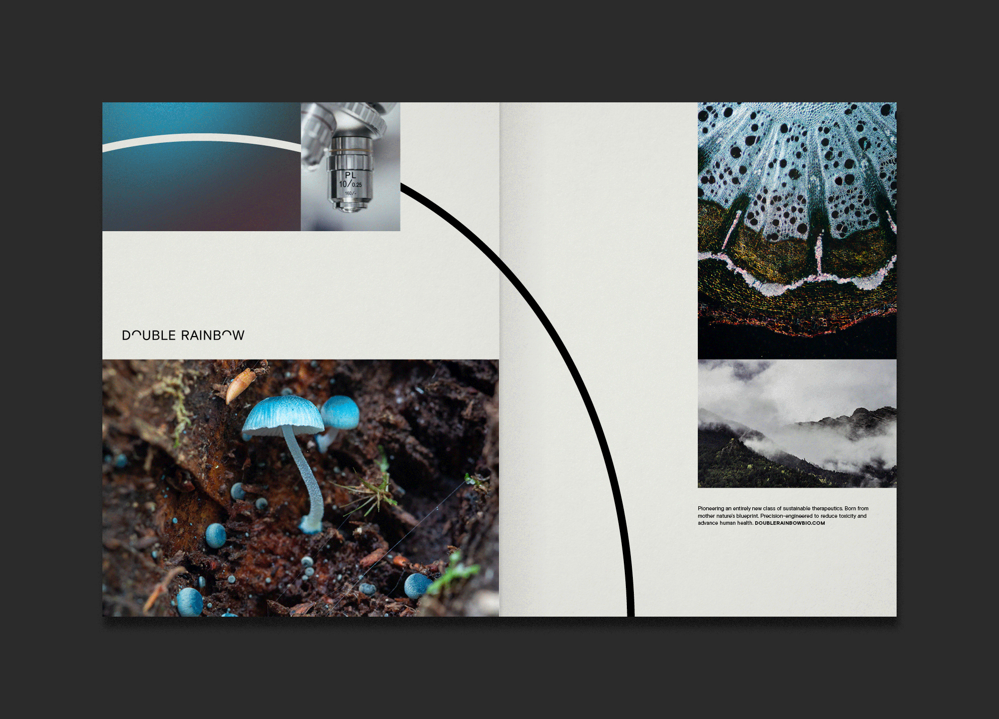
Double Rainbow Biosciences seeks to harness 500 million years of natural evolution to uncover, through bioengineering, the keys to improve the quality of human health while ensuring our planet’s sustainability.
One Design worked with the biotech startup—founded by Jing-Ke Weng of the Whitehead Institute—to craft a sophisticated brand strategy and identity that breathes life into the team’s vision, as they moved out of stealth and onto the national stage.

Enhancing health. Sustaining our planet.
Double Rainbow blends the wisdom of centuries of traditional medicinal practice with modern day technological innovation, creating a new way to bring the healing properties of nature to people around the globe without harming the planet.
We crafted a brand promise and body of language that embraces and celebrates this duality, honoring both traditional philosophy and modern innovation.

Inspired by nature, perfected by science to enhance human health.
Our brand identity—a simple, elegant mix of clever typography, photography, and color—balances a deep reverence for the wonder of the natural world with the precision and technical focus of modern technology and bioscience. It is the embodiment of their ethos and vision.
The elegantly refined wordmark counterbalances the mystic qualities of the name “Double Rainbow,” while the color palette symbolizes the act of mimicking the compounds in nature that heal. Blurred imagery of the natural world—plants, bacteria, and fungi—further alludes to the act of sustainable chemical translation made possible by the company’s innovations in bioengineering.
The dual arches introduced in the wordmark reappear as a consistent graphic element, elegantly linking the natural world and the lab, the scientist and the consumer, traditional perspectives and technological innovation.


A comprehensive toolkit
The Double Rainbow brand came to life through a suite of activations. A robust and evolving website tells an in-depth story of the company’s pioneering innovation. Communication materials and templates in both the digital and print space allowed the Double Rainbow team to own their communication strategy, supported further by a robust digital asset management system.


A sustainable foundation for evolution
A comprehensive brand architecture established the blueprint for future growth into consumer and pharmaceutical markets. A range of sub-brands includes the consumer-facing supplement company, Landkind, which the One Design team had the honor of branding. From positioning to naming, identity development, packaging design and beyond, the team worked to bring the philosophies of the parent brand to this offshoot, with its flagship product set to launch in the summer of 2022.

Learn more at landkind.health, and stay tuned for a more robust case study to come!